


.jpg)


As the old saying goes, if you give a man a fish, he’ll eat for a day. But if you teach him to fish, he will feed himself for a lifetime. The same can be said about web design tools. If you give a designer a tool, they will use it to create websites until they’re blue in the face. But, if you teach designers how to use that tool efficiently and effectively, they will continue learning it and find new ways to master their craft every time they sit down at their desk. We use Webflow because of its efficiency and effectiveness.
The Importance of Using the Right CMS for the Job
Before we dive into the benefits of using Webflow, let’s first discuss why it’s so important to choose the right CMS for the job.
While it’s always great to have options, it’s important to remember that no two CMSs are created equally. Each CMS has its own distinct features, capabilities, and learning curves. Choosing the wrong CMS for your project could result in massive headaches, delays, and expensive re-designs in the future. By choosing the right CMS, you can save yourself a lot of headaches and money in the long run. And believe us, choosing Webflow is the right choice for us.
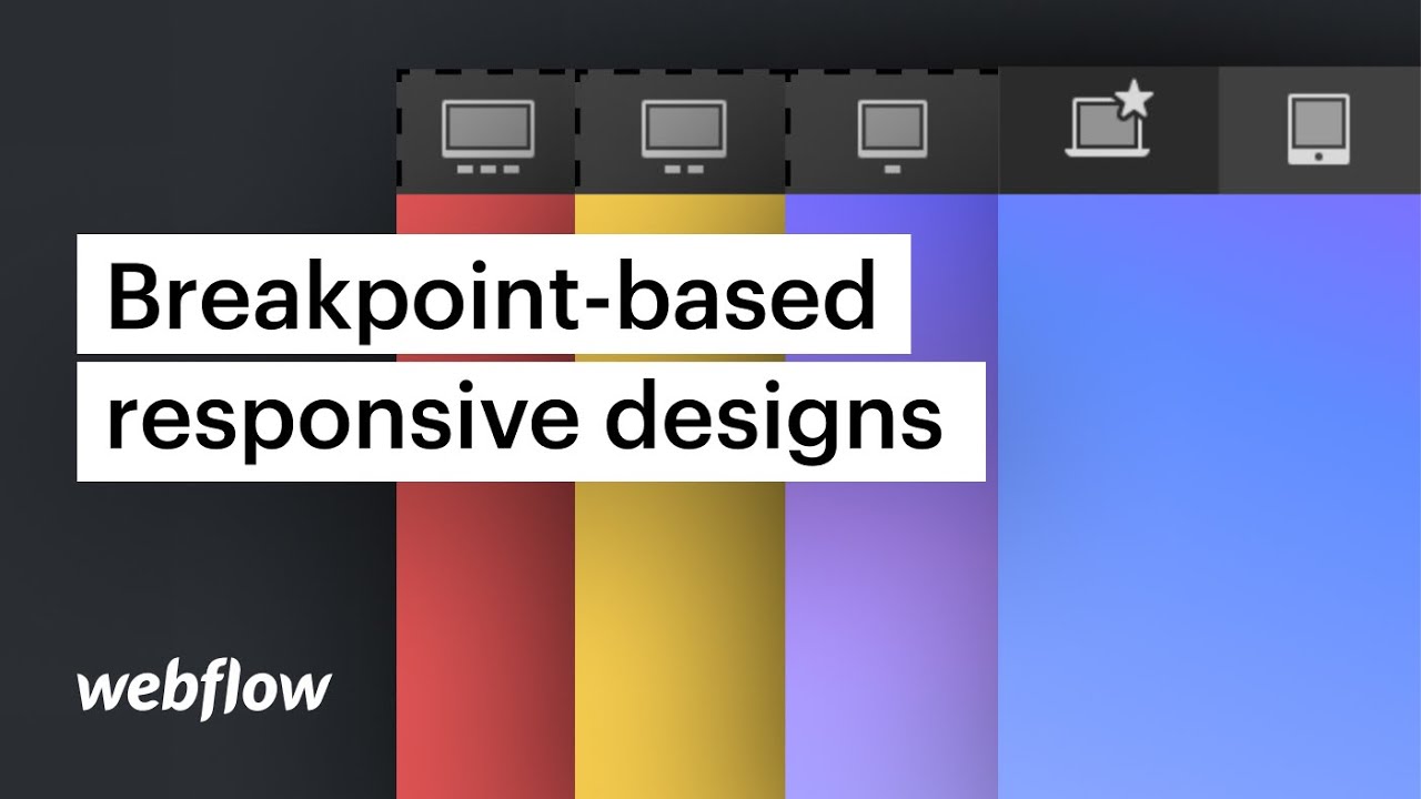
Webflow is Responsive by Default
If you aren’t familiar with the benefits of responsive design, now is the time to start learning! Responsive design is the practice of creating a website that responds to the user’s device and resizes itself accordingly. This means that, on a desktop computer, a responsive website will fit the entire screen. On a laptop, it will fit the screen width-wise. On a smartphone, it will fit the screen width-wise and height-wise.
Webflow is a 100% responsive CMS. This means that, by default, your website will be responsive. No need to create a separate mobile version of your site. The same site will work for all devices.
Instantly See How a Change Will Look Before You Commit
Webflow has something called “Live Preview” and it’s a huge timesaver! This feature allows you to instantly see how a change you make to your website will look before you commit it.
Let’s say you want to add a new feature to your website. You can add the feature to your site and then immediately see how it looks in the browser. If the feature looks the way you want it to, then you commit it. If it doesn’t look right, you simply undo it and try again until you get it right.
Live Preview is extremely useful if you’re designing in a team environment. You don’t have to waste time waiting for everyone to view and approve a change before moving forward. You can see how that change looks in real-time. Webflow’s Live Preview feature will save you time and energy by letting you see exactly how your changes will look before you commit them.
There’s No Need to Re-code
We’re not going to lie to you. It’s fun to write code. It’s fun to be able to create whatever you want from scratch. However, if you’re not a developer and you don’t have the time or money to build a website from scratch, re-coding a website is often the only other solution. Adding elements and features to a website that was coded from scratch can be extremely time-consuming. Because you have to manually code everything into the site, it can often take weeks or months to get the site up and running.
Webflow, however, doesn’t require any re-coding. Because you’re working with an existing CMS, you can instantly add new features and elements to your site. There are times when you may need to re-code a small portion of your site. But, for the most part, you can design and manage your entire site in Webflow.
Conclusion
Webflow is a fully-featured CMS that allows you to create beautiful, responsive websites. It’s an excellent choice for designers of all skill levels because it has built-in coaching and debugging tools that will help you learn as you go. There’s no need to re-code and it has real-time co-authoring so that you can work with your team members in real-time. Webflow is responsive by default and has built-in drag and drop functionality.


.jpg)


