


A Bold Comic-Inspired Brand for Gastown’s New Smash Burger Spot
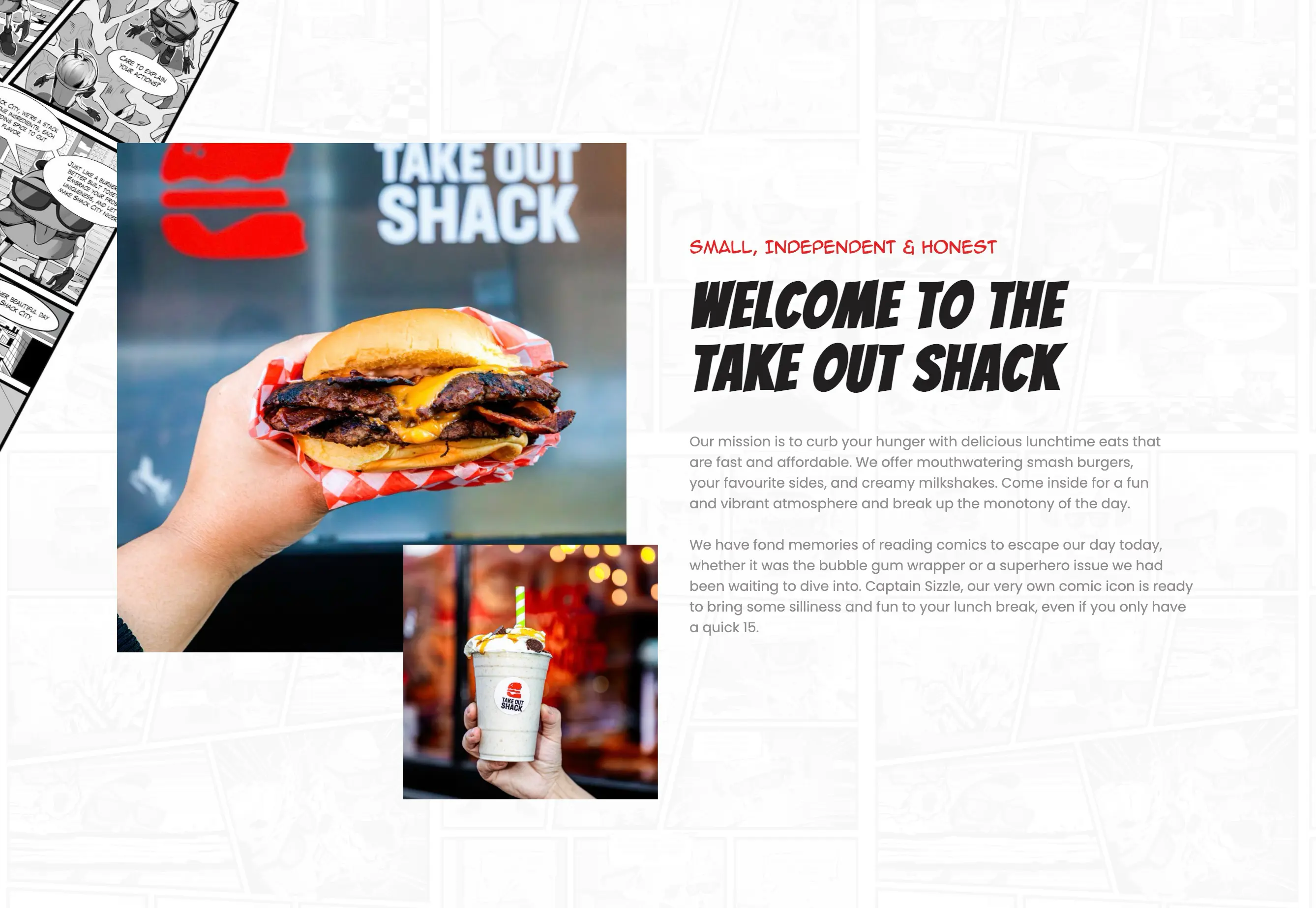
Take Out Shack is a new local eatery located in the heart of Gastown, serving fast, affordable, and ridiculously delicious lunchtime eats. Their menu focuses on smash burgers, creamy milkshakes, and fun comfort food, all wrapped in a vibrant, nostalgic comic-book atmosphere.
As a brand-new business with no previous website or online presence, they needed everything: a visual identity, a digital foundation, and a brand story that would stand out in Vancouver’s highly competitive food scene.
The owners envisioned something bold, playful, and memorable, a modern comic-inspired universe brought to life through characters, stories, and vibrant design. Our job was to build that world from the ground up.
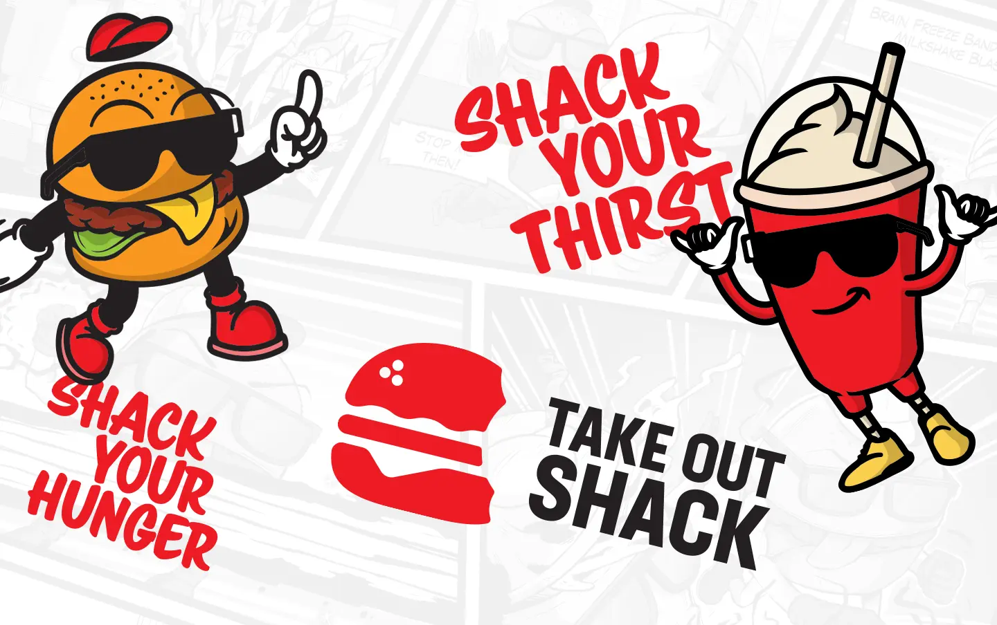
Creating a Brand Universe From Scratch
This wasn’t just a logo project. It was the birth of a full brand identity shaped around fun and personality.
We created:
- A bold modern logo
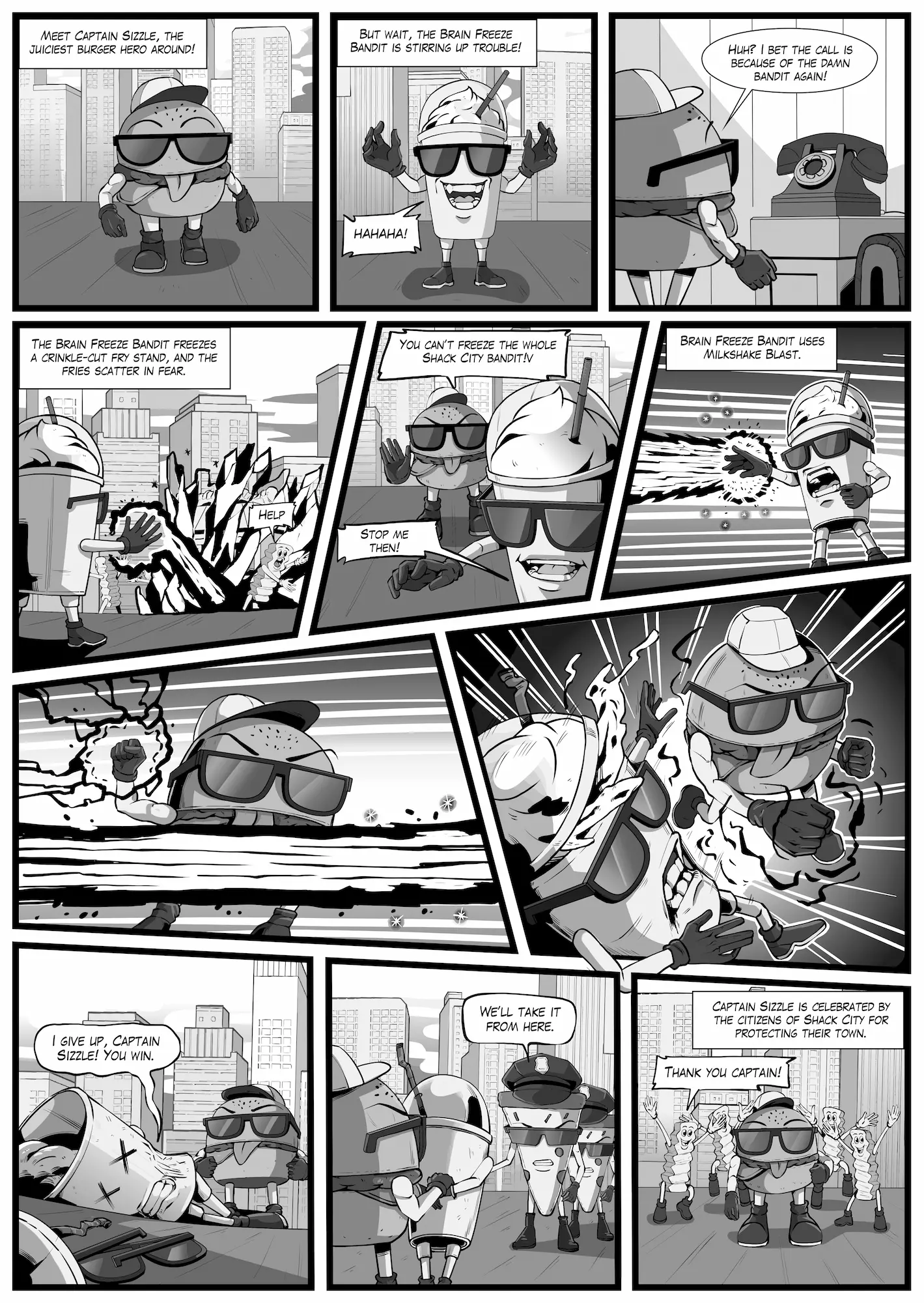
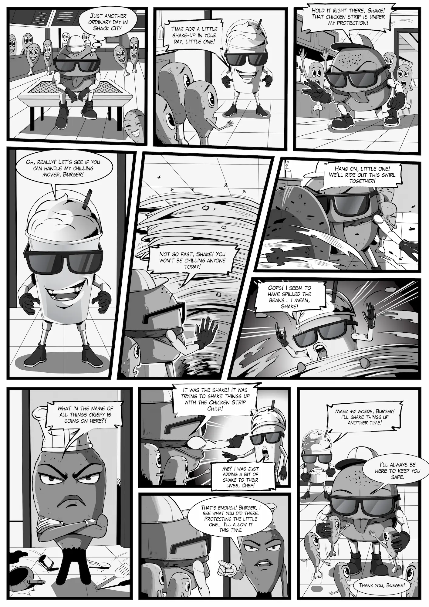
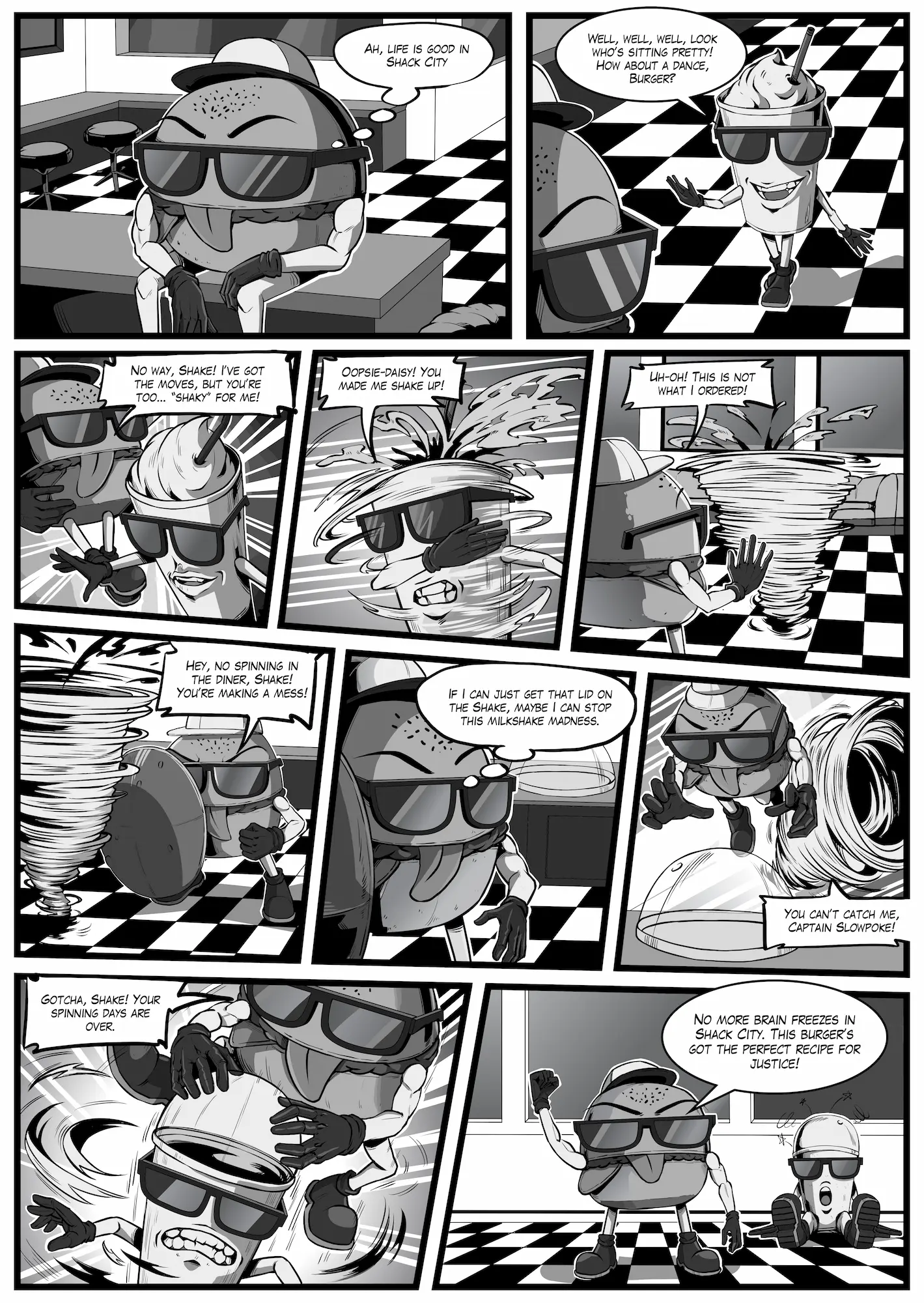
- Two mascots: a burger superhero (Captain Sizzle) and a milkshake super-villain (Brain Freeze Bandit)
- A unique visual system blending clean modern design with vintage comic textures
- A cohesive brand voice that’s playful, fast-moving, and full of character
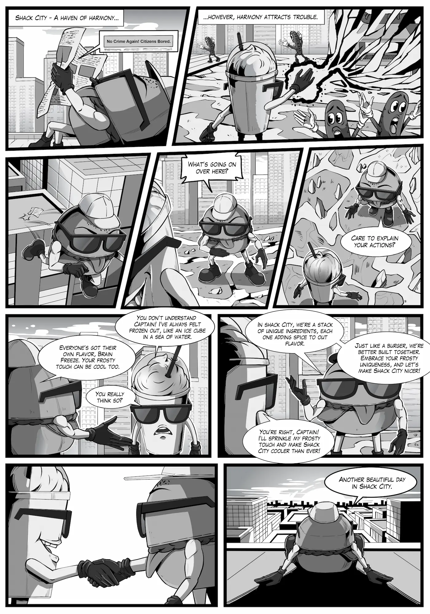
- 4 original comic book stories starring the mascots, now used as wallpaper inside the venue.
These short stories bring the brand to life, giving customers something to smile at whether they’re waiting for their burger or exploring the space. The comics also tie perfectly into Take Out Shack’s mission: to add fun, silliness, and a quick escape to everyone’s lunch break.
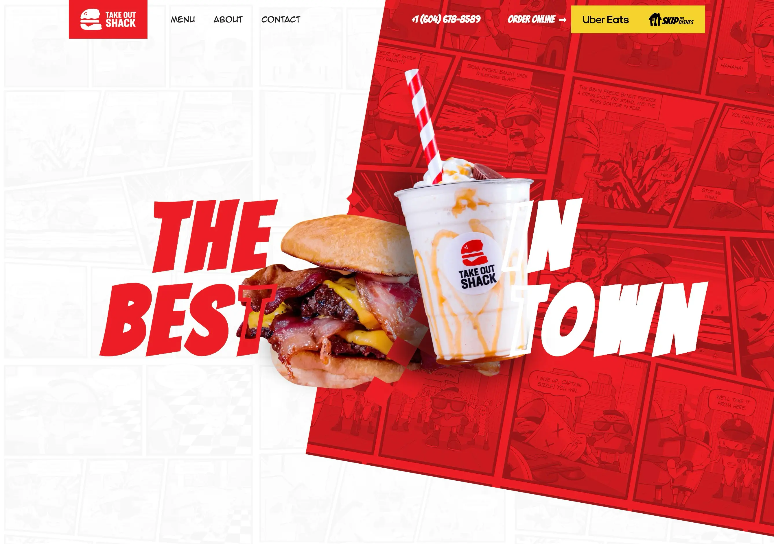
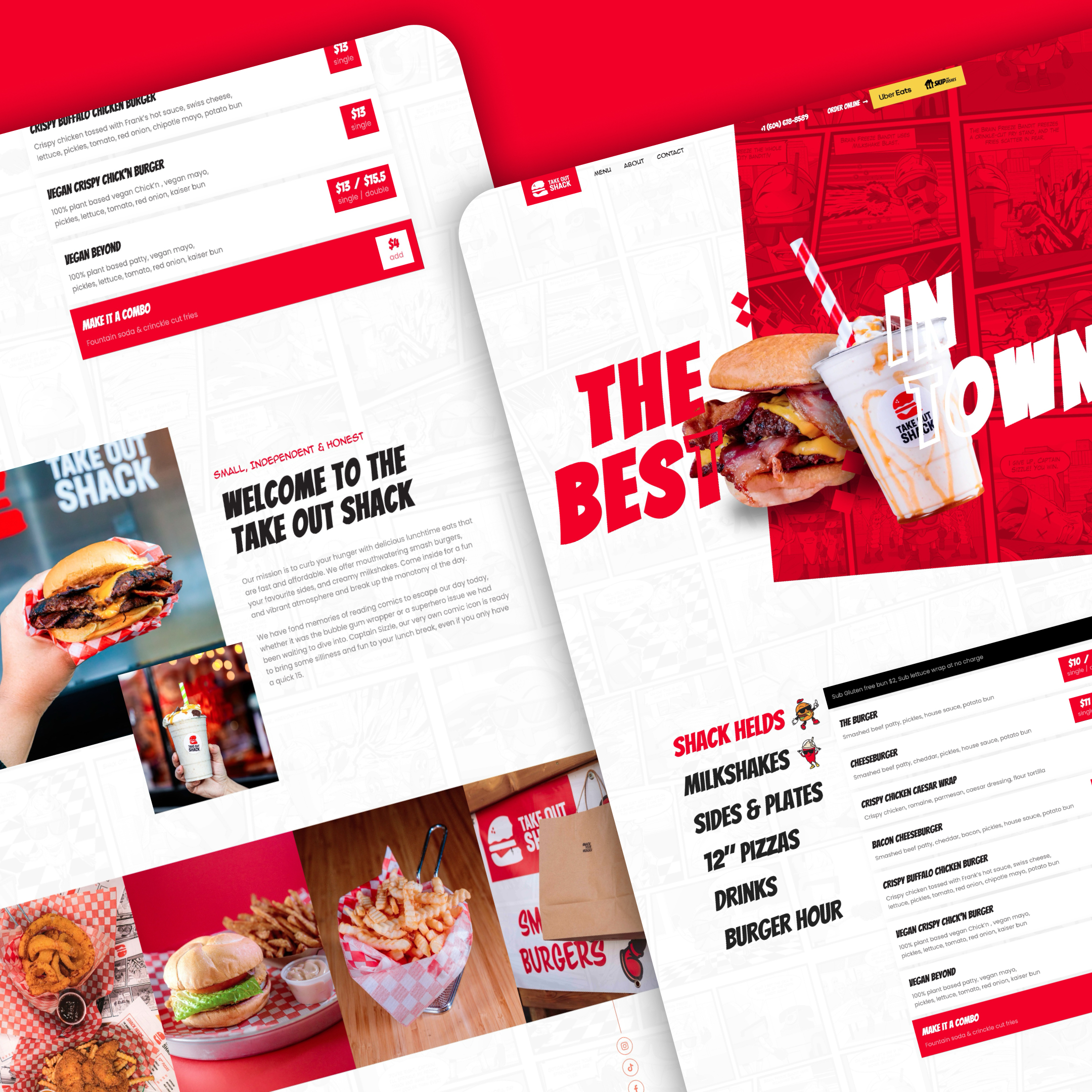
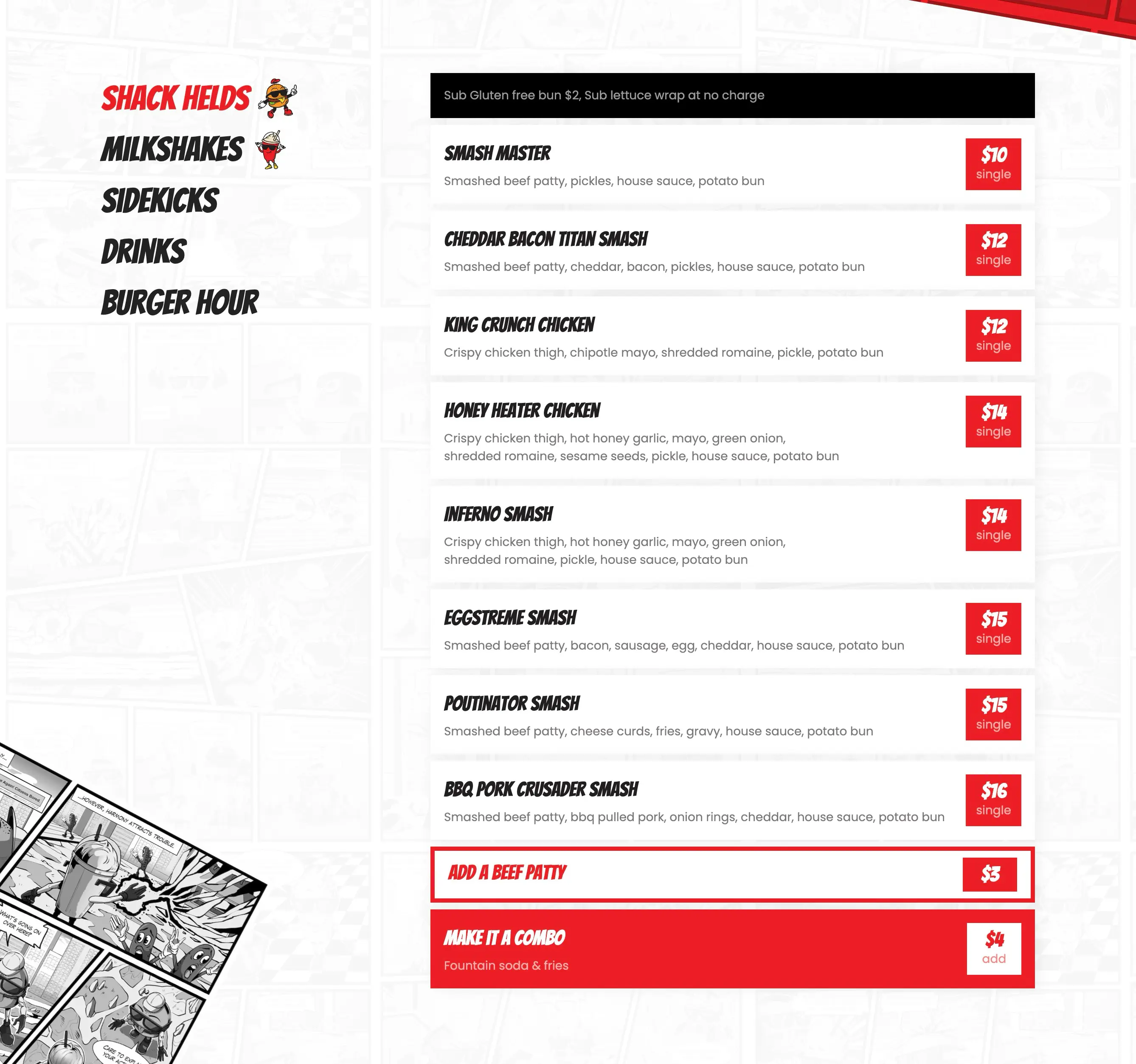
Designing a Website as Fun as the Brand
With the brand foundations in place, we designed and developed a website that feels just as bold and animated as the physical space.
The site includes:
- Comic-style illustrations and panels
- Bright colors and punchy typography
- A bold layout that mirrors the in-store experience
- Easy-to-scan menus and food categories
- Smooth interactions that give the site personality
- Responsive design optimized for mobile users on the go
Because the business was brand-new, SEO structure was especially important. We implemented a strong local SEO strategy to help Take Out Shack appear in searches for terms like Gastown lunch, Vancouver smash burgers, Vancouver milkshakes, and takeout near me. The site was built with semantic HTML, optimized metadata, clean URL structure, and fast-loading assets to support visibility from day one.
A Digital Launch Built for Growth
Since Take Out Shack had no prior digital footprint, we ensured everything was set up for a successful launch:
- Strong SEO foundations
- Clearly structured content for future updates
- A visual design that sets them apart from local competitors
- A brand universe customers instantly recognize and remember
The entire system, from the mascots to the comics to the website, was designed to scale easily as the business grows, whether they add new menu items, expand marketing efforts, or introduce more characters and stories.
The Outcome
Take Out Shack now has a fully realized identity that extends far beyond a standard restaurant brand. Their comic-inspired world gives them a personality customers instantly connect with, while the sleek, modern website makes it easy for locals and tourists to discover the brand, explore the menu, and choose Take Out Shack for their next lunch break.
With a bold logo, custom characters, illustrated stories, and a strong digital presence, the brand now stands out in the heart of Vancouver — offering not just great food, but a fun, memorable experience.


More from our workshop

Malone's Taphouse


.svg)

Summer Latin Cruises

.jpg)
Vancouver Latin Fever
.jpg)
Cask & Keg
.jpg)
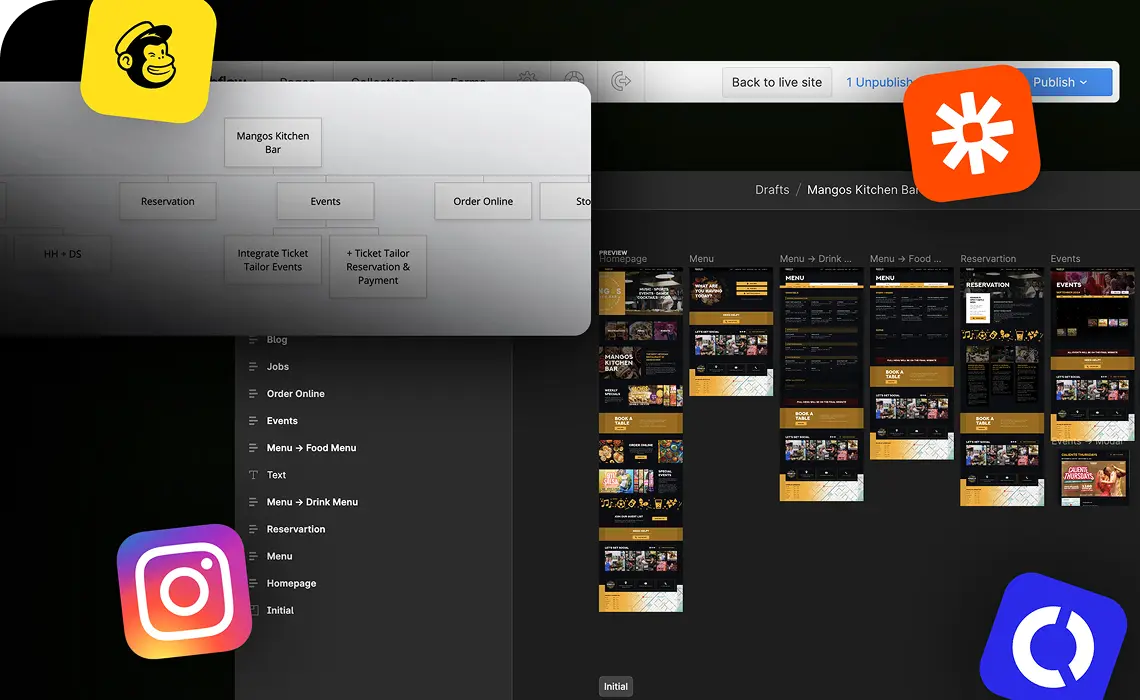
Mango's Kitchen Bar
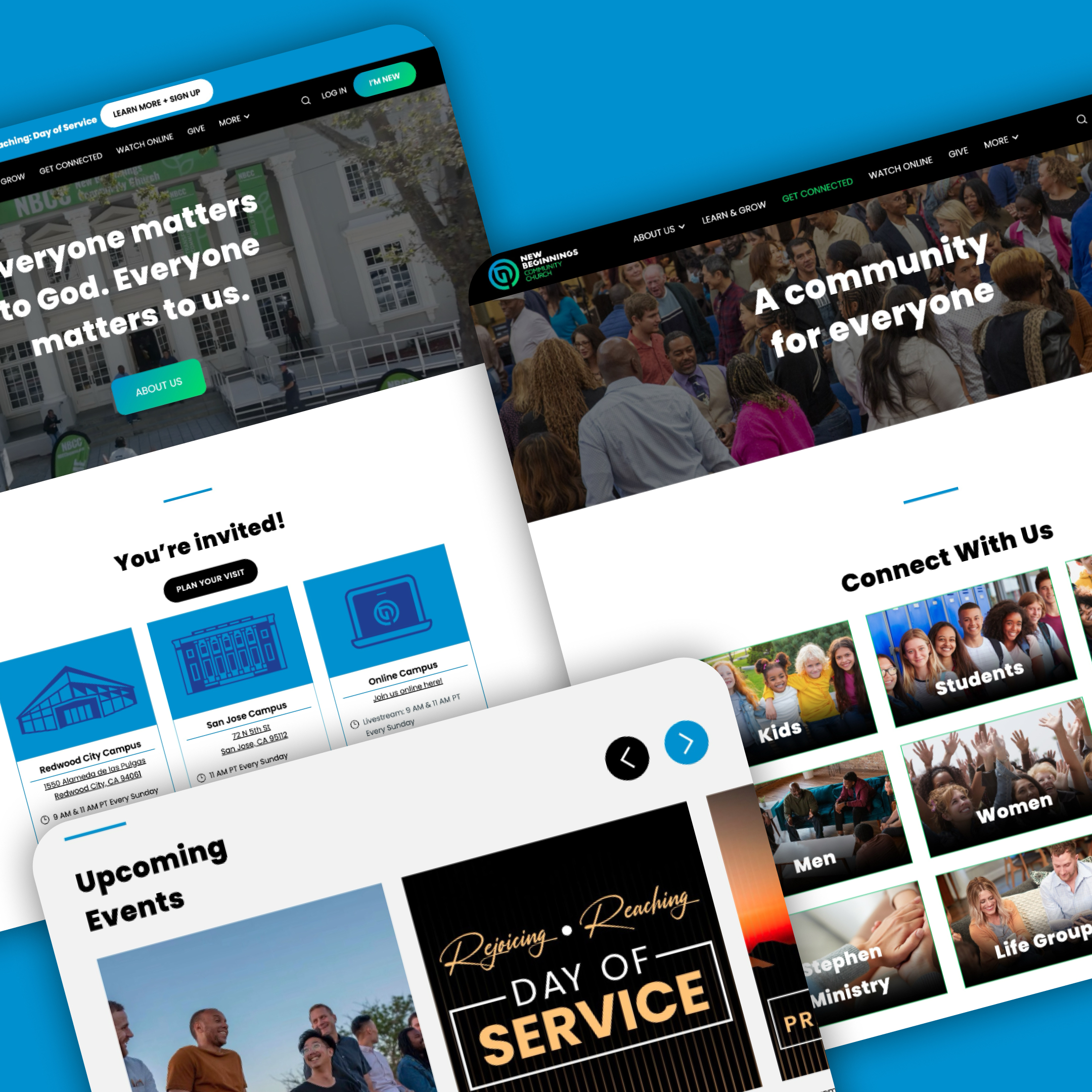
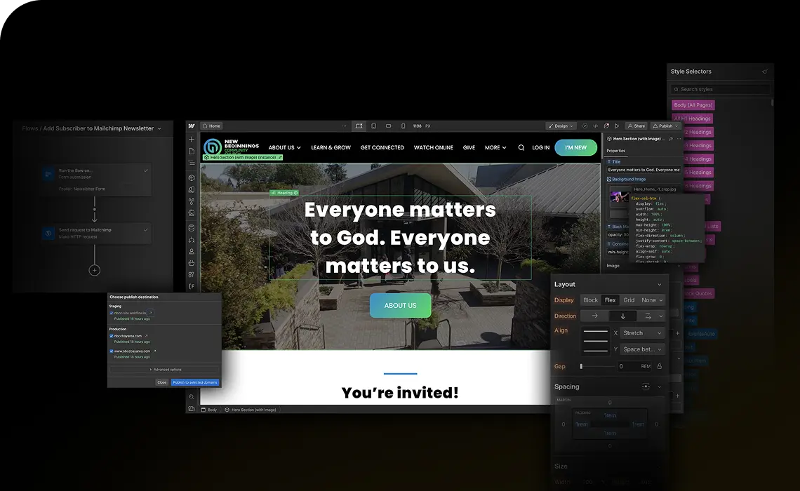
New Beginnings Community Church
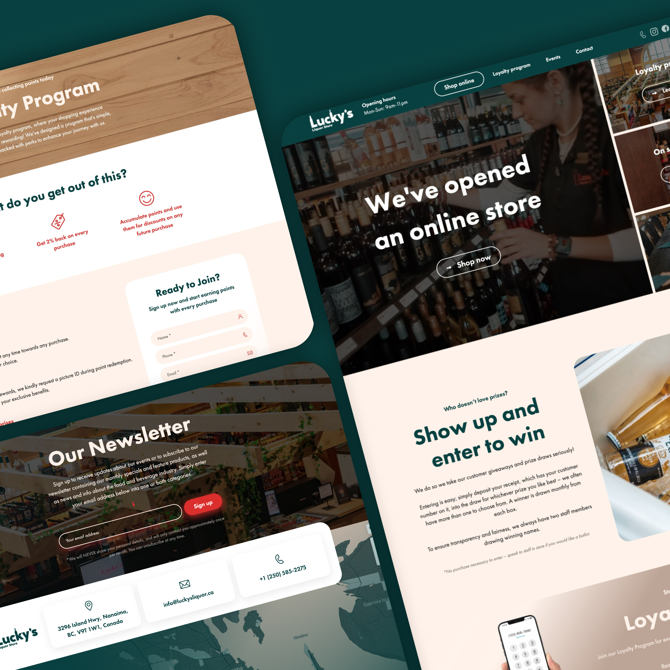
Lucky's Liquor Store
.jpg)
The Cambie Malones Group
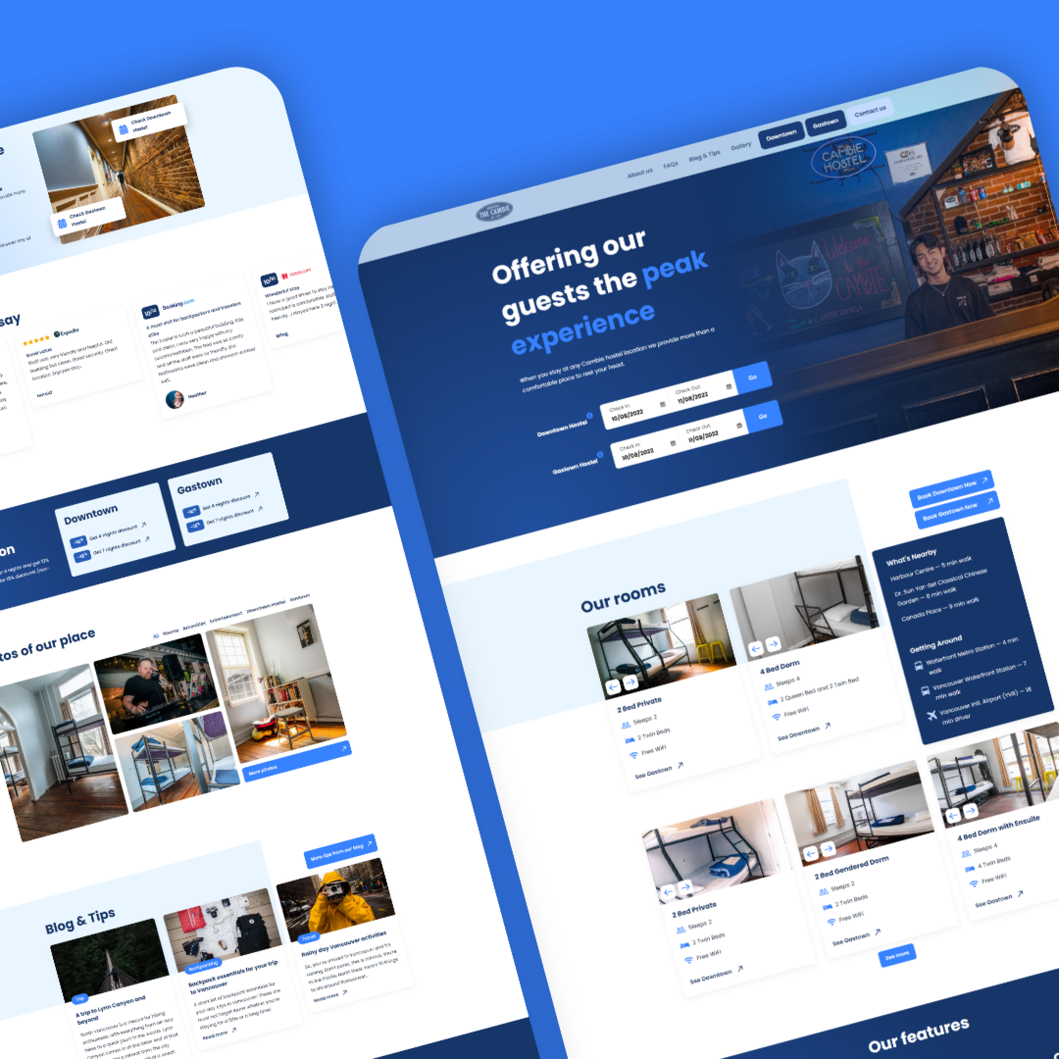
The Cambie Hostels

.jpg)
The Cambie Bar
.jpg)
Our 3-step
creation process
STEP 1
STEP 2
STEP 3


.svg)